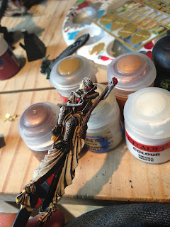
Still WIP-ping on this, but im loving the process. Its stopped looking so monochrome since ive started putting things together. also approaching the shading on different materials gives them a nice change. the next big challenge is going to be a big leap. blending the scales on the dragon from yellow to orange to red to purple to blue to turquoise to white *wheeze*. and the only way i can think of doing this seamlessly is by giving it a base of red to blue then sticking it together then greenstuff to cover up them seams then fiddly painting for ages. As you can see below
So here is where ive got to with the rest. the banner fits perfectly with the arm and throne! bit of shaving and crafty scraps of cloth and there you have it! ive gone with a cream cloak for Eleanor to give me a blank canvas for freehand if im feeling brave and energetic at the end of the project. and if not. it looks nice :)
And here is a mock up of the whole thing together:
Thanks for reading! and ill check in again tomorrow, would definitely recommend this model. its sat in my bits box for months and its been a treat.


You've done an amazing job on that banner. Glad it's starting to be put together, really excited to see the whole thing finished as the Carmine Dragon is by far my favourite thing out of forgeworld.
ReplyDeletecheers dude! im actually trying to think of things to cover up the wreath on the banner with. the wreath and scroll work are both greenstuff. really happy with the scroll but the wreath just looks too clumpy. and if i take it off it will ruin all the blending on those checkers!
DeleteHaha, I was so taken with the checkers I didn't even notice the wreath. It does definately need something there to break up the checkers, but I'm not sure that wreath is it (though I like the green)
DeleteWhats the reasoning for the checkers being a different blue on the banner to the inside of her cloak? (P.S. not a critism at all, just trying to learn :-)
Cheers man. The idea was to make them look like a different material. As if her dress is a fine regal weave and the banner is rough stitched and bright
DeleteDamn, you've really bitten off a load with the colour scheme, can't wait to see it. Love your painting style.
ReplyDelete